


P1 Micropage Settings
The P1 template is a single-page donation micropage. This settings panel lets you control every part of that page, including the brand header, the hero, the campaign numbers, the navigation links, each content section, the mobile sticky donate bar, and the footer, without writing any code.
Before You Start
The panel is built from a few simple building blocks. Once you recognise them, every section works the same way.
- Collapsible cards: every section sits inside a card. Click the chevron button in the top-right corner to fold or unfold it. Folding a card does not change any settings.
- Toggles: a checkbox such as Show hero decides whether that block appears on the published page. Untick it to hide the block; the fields underneath disappear, but your content is kept.
- Add / Remove buttons: list-style sections (stats, steps, impact items, updates, testimonials) have an Add button at the bottom and a Remove button on each card. Remove only appears when the list is above its minimum size, so you can never delete a required item.
- Rich text fields: any field labelled Body, Subtitle, Description, Text or Quote uses a text editor. You can add bold, italics and links there.
Brand
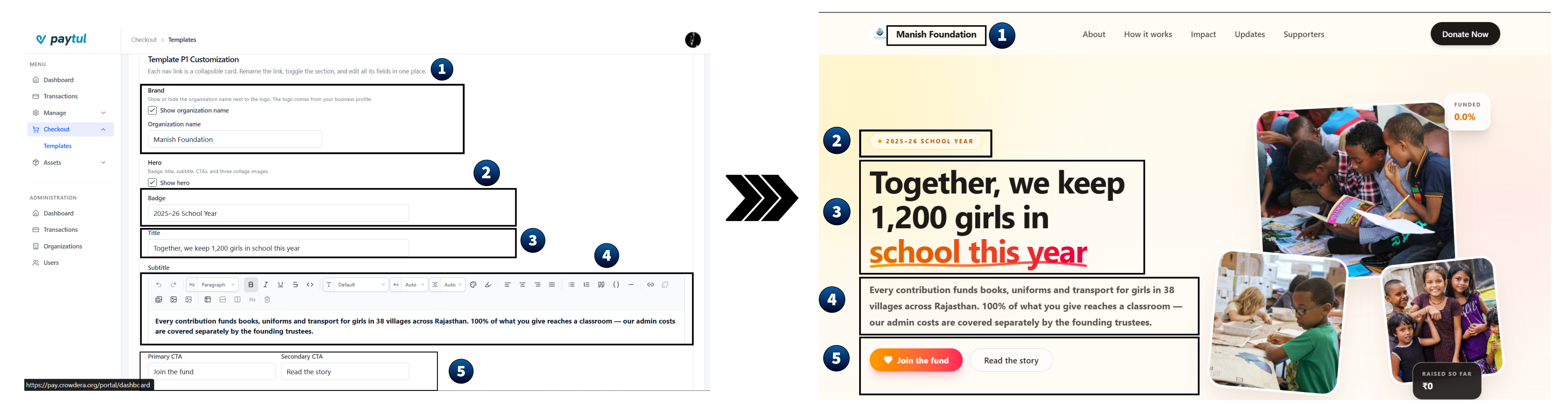
Controls the organisation name shown next to your logo in the header.
- Tick Show organization name to display the name. This toggle is off by default, so only the logo shows until you enable it.
- When it is on, the Organization name field appears. Type the name exactly as you want it to read (for example
Community Fund).
Hero
The first thing a visitor sees: a badge, a headline, a short description, two buttons, and a three-image collage.
Text fields
| Field | What it does | Example |
|---|---|---|
| Badge | Small pill above the headline | Community Fund |
| Title | The main headline of the page | Together, we keep 1,200 girls in school this year |
| Subtitle | Rich-text paragraph under the headline | Every contribution funds books, uniforms, transport… |
| Primary CTA | Label of the main button | Join the fund |
| Secondary CTA | Label of the second button | Read the story |
Collage images
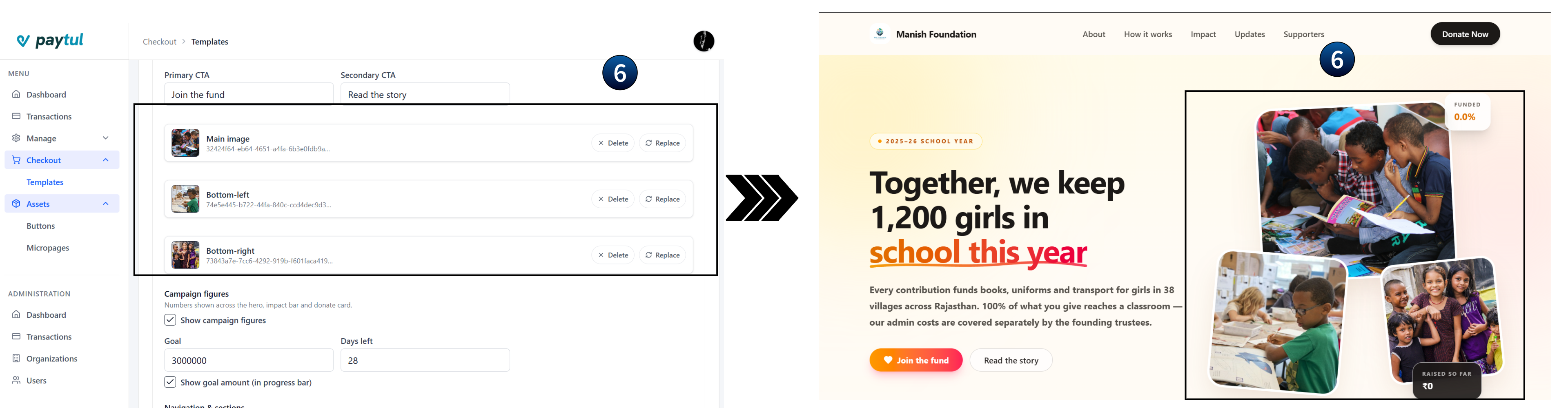
Three upload fields build the image collage next to the headline. Upload each one in the order shown:
- Main image: the large image at the top of the collage.
- Bottom-left: the smaller image under the main one.
- Bottom-right: the second smaller image.
Campaign Figures
These numbers are reused across the hero, the impact bar and the donate card, so you only enter them once.
- Goal: the total amount you are raising. This drives the progress bar.
- Days left: how many days remain in the campaign. Leave it blank if the campaign has no deadline.
- Show goal amount: tick to display the goal figure inside the progress bar. Untick it if you want to show only the amount raised.
# Correct
Goal:       3000000
Days left:  8

# Incorrect (will not render correctly)
Goal:       ₹30,00,000
Days left:  8 days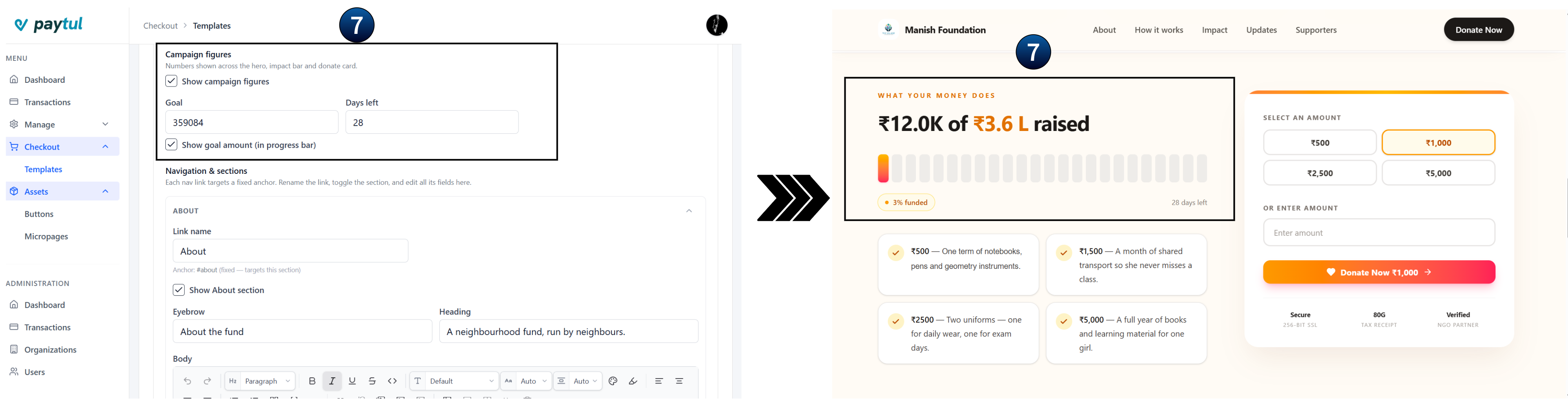
Navigation & Sections
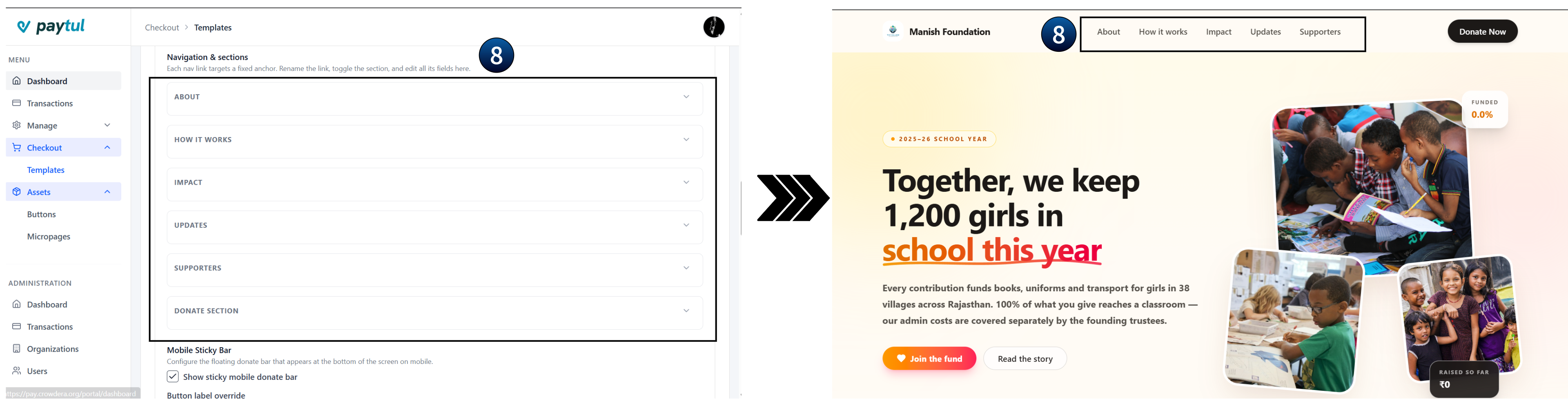
This is the largest part of the panel. Each navigation link is paired with the content section it points to, so everything for one section lives in one card. Rename the link, toggle the section on or off, and edit all of its fields in the same place.
| Card | Default label | Anchor |
|---|---|---|
| 1 | About | #about |
| 2 | How it works | #how |
| 3 | Impact | #impact |
| 4 | Updates | #updates |
| 5 | Supporters | #supporters |
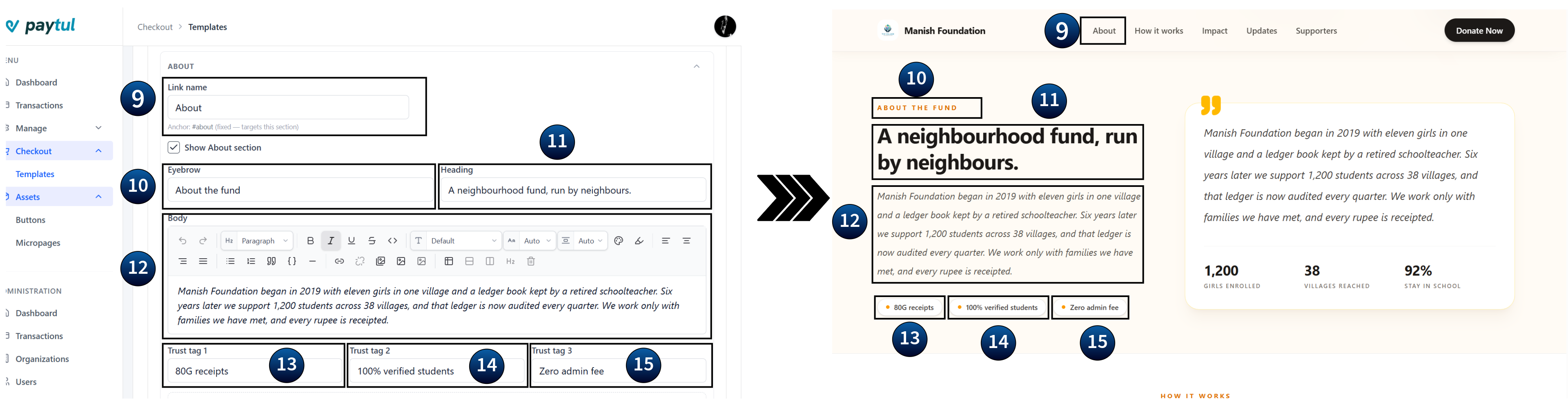
1. About: #about
- Eyebrow: the small label above the heading (for example About the fund).
- Heading: the section headline.
- Body: a rich-text paragraph telling the story of the fund.
- Trust tags 1-3: three short credibility labels shown as pills (for example 100% verified, 80G receipts, Zero admin fee).
Impact stats (inside About)
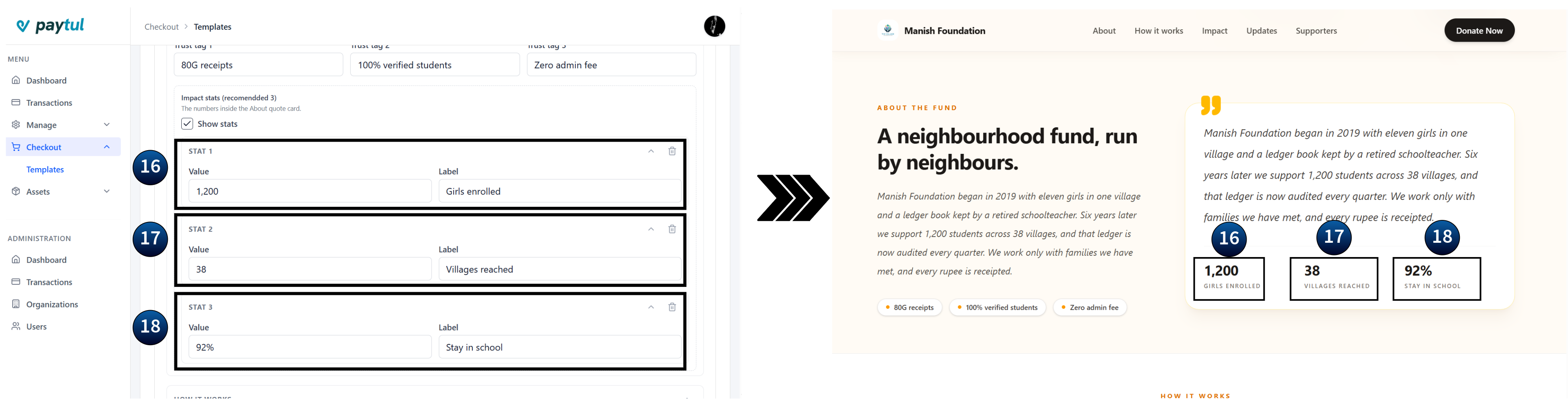
These are the numbers shown inside the About quote card. Tick Show stats to display them, then fill in up to three stats, each with a Value (for example 1,200) and a Label (for example Girls enrolled). Use Add stat for a second or third, and Remove to delete one.
2. How it works: #how
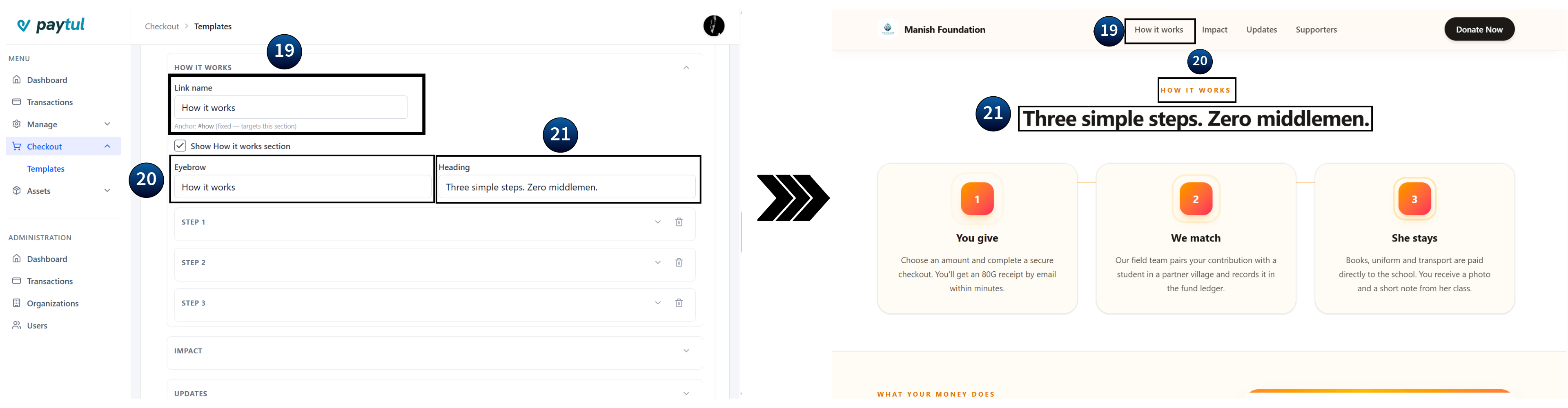
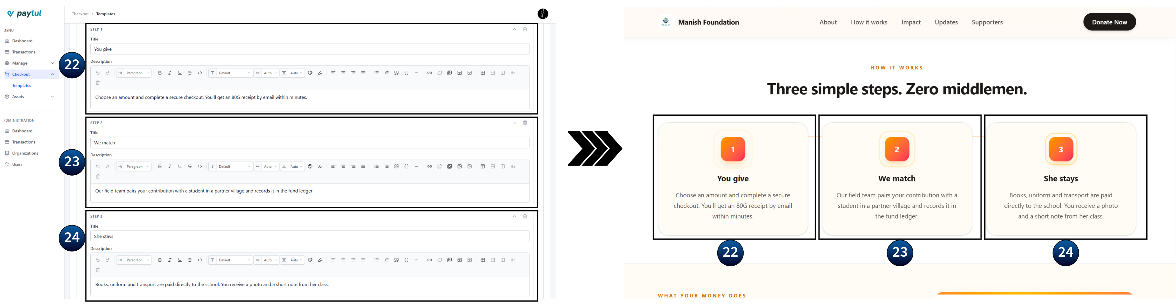
An eyebrow, a heading, and a numbered list of steps. You can have between 1 and 3 steps. The template is designed for three, which keeps the row balanced on desktop.
- Step title: a short action phrase, for example You give.
- Step description: a rich-text explanation, for example Choose an amount and complete a secure checkout…
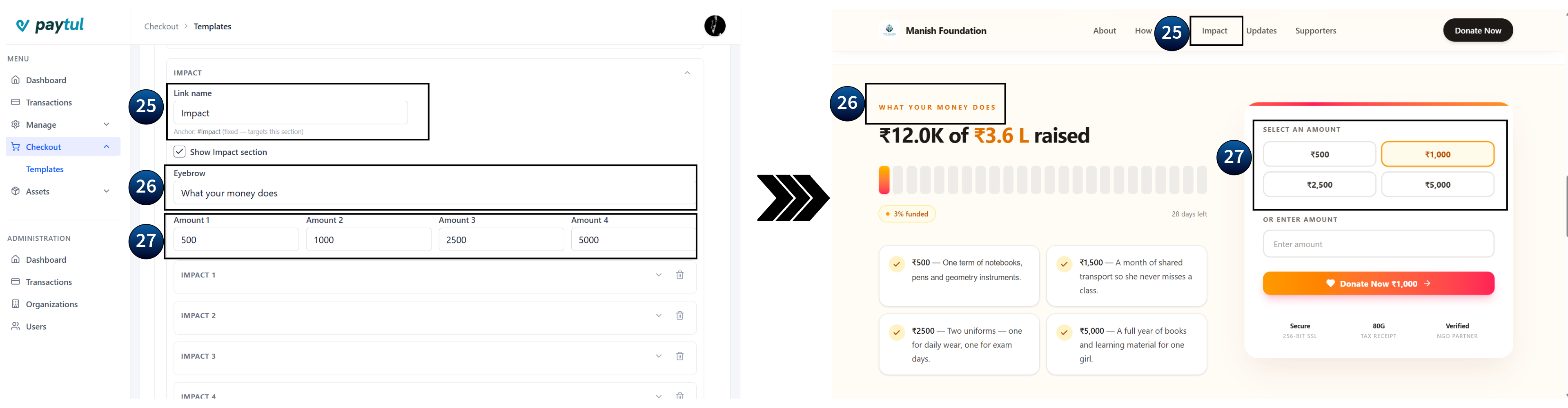
3. Impact: #impact
Shows what different donation amounts achieve.
- Eyebrow: for example Live progress.
- Amount 1-4: the four preset donation buttons on the donate card. Defaults suggest
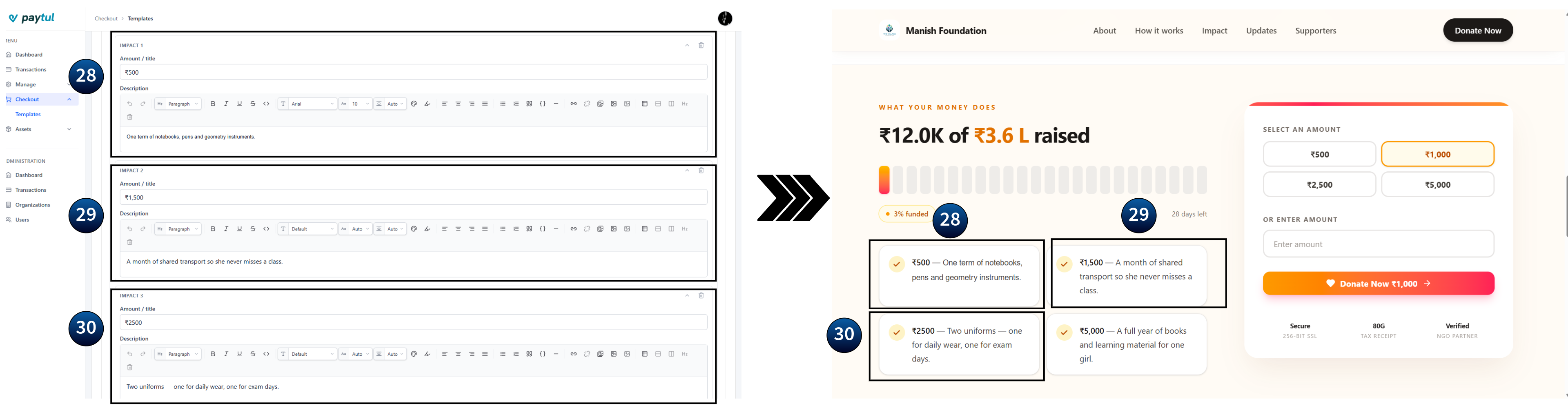
1000,2000,5000and10000. Enter plain numbers only. - Impact items: each item pairs an Amount / title (for example ₹1,000) with a Description (for example One girl's books and learning material for a year.). There is no upper limit. Add as many as you need.
4. Updates: #updates
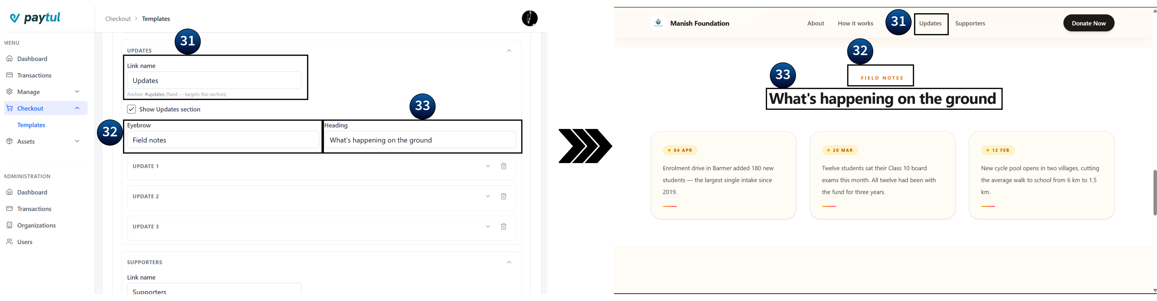
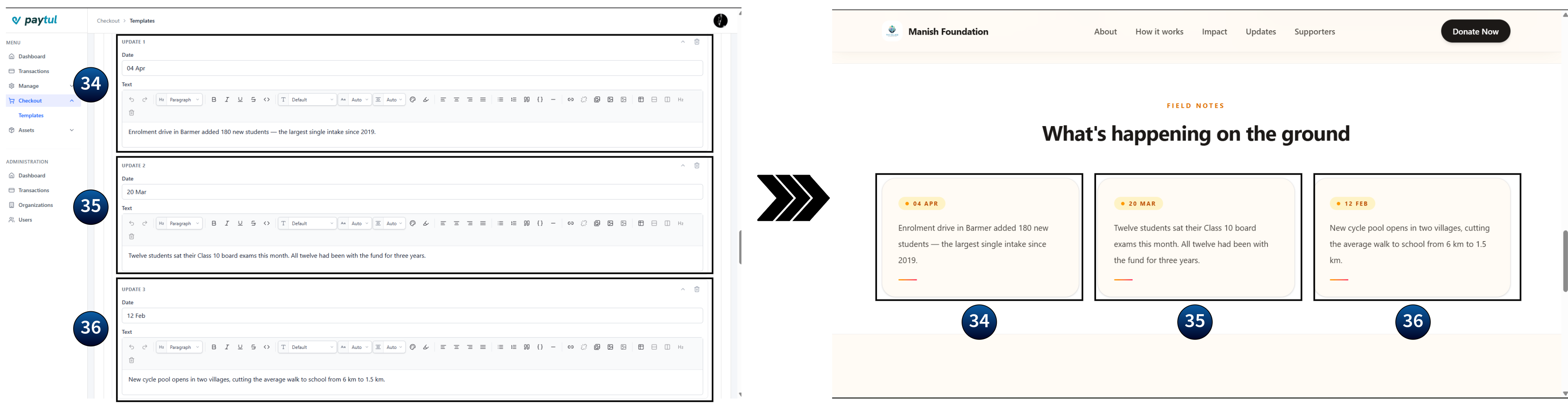
A short field-notes timeline. Add between 1 and 3 updates. Each one has a Date (for example 20 Mar) and a rich-text Text entry (for example Enrolment drive added 180 new students…).
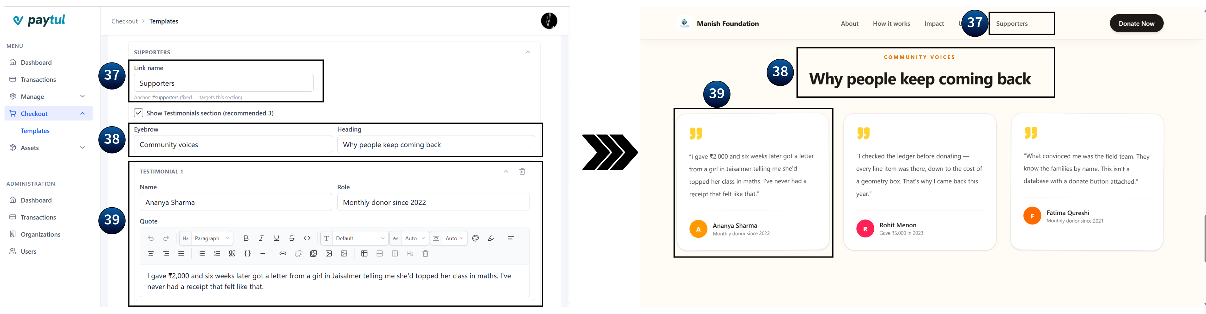
5. Supporters: #supporters
Donor testimonials. Add as many as you like. Three is recommended so the row stays balanced. Each testimonial has:
- Name: for example Ananya Sharma.
- Role: for example Monthly donor since 2022.
- Quote: rich-text testimonial text.
Donate Section
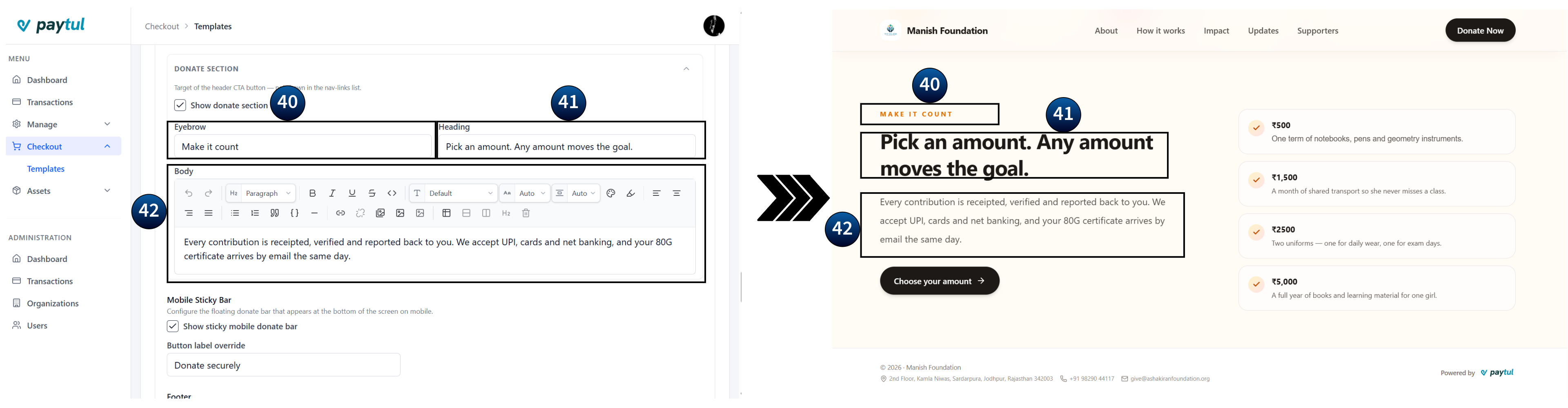
The main donation block at the bottom of the page. It appears as its own card below the five navigation cards.
- Show donate section: on by default. Turning this off removes the checkout block entirely, so only do it if you are linking to an external donation form.
- Eyebrow: for example Make it count.
- Heading: for example Pick an amount. Any amount moves the goal.
- Body: a rich-text reassurance text, for example Every contribution is receipted, verified…
Mobile Sticky Bar
A floating donate button pinned to the bottom of the screen on mobile devices, so visitors can give from anywhere on the page.
- Show sticky mobile donate bar: on by default. Turning it off removes the floating bar on mobile; desktop is unaffected.
- Button label override: replaces the default button text, for example Secure Checkout. Leave it blank to use the template default.
Footer
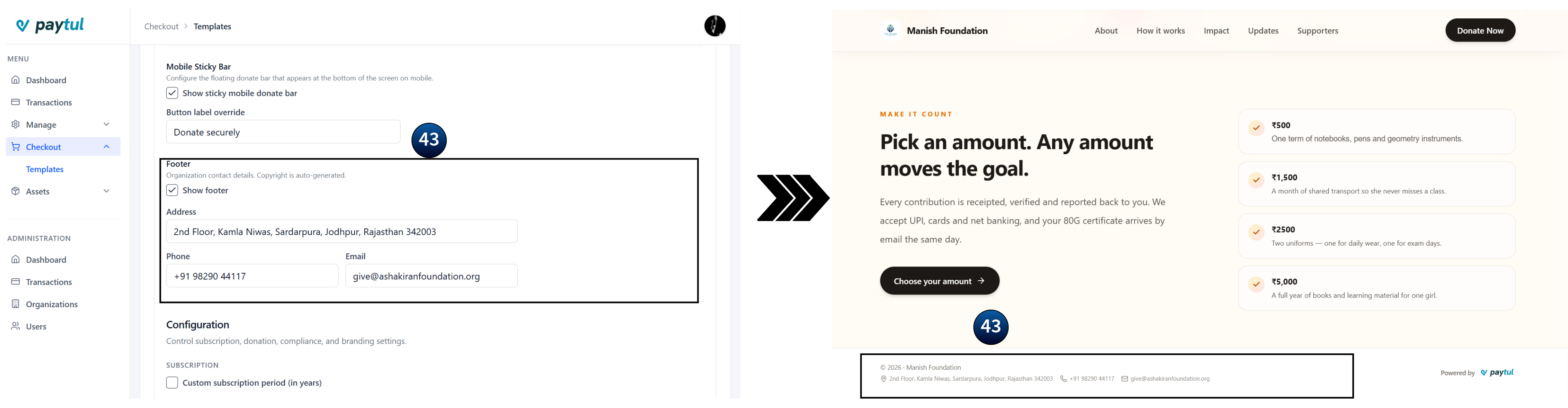
Organisation contact details shown at the bottom of the page.
- Show footer: on by default.
- Address: the full postal address (spans both columns).
- Phone: a reachable contact number.
- Email: a monitored inbox.
Limits & Quick Reference
The number of items each repeating list accepts. The Remove button is hidden once a list reaches its minimum, and Add disappears once it reaches its maximum.
| List | Located in | Minimum | Maximum |
|---|---|---|---|
| Impact stats | About | 0 | 3 |
| Steps | How it works | 1 | 3 |
| Impact items | Impact | 1 | No limit |
| Updates | Updates | 1 | 3 |
| Testimonials | Supporters | 1 | No limit |
Toggles at a glance
| Toggle | Hides | Default |
|---|---|---|
| Show organization name | Name next to the logo | Off |
| Show hero | The whole hero block | On |
| Show campaign figures | Goal, days left and progress bar | On |
| Show goal amount | Goal figure inside the progress bar | On |
| Show stats | Stats inside the About card | On |
| Show <section> section | Any of the five nav sections | On |
| Show donate section | The donation block | On |
| Show sticky mobile donate bar | Floating mobile bar | On |
| Show footer | Contact details block | On |
Before You Publish
- Preview on a phone. Most donations happen on mobile, so check the hero, the preset amounts and the sticky bar at that width.
- Check every navigation link. Click each one and confirm it scrolls to the section you expect, especially after renaming links.
- Use plain numbers for the goal, days left, preset amounts and stat values.
- Fill in the footer contact details. Donors look for a phone number and email before giving. An empty footer reduces trust.
- Keep copy short. Eyebrows are a few words, headings are one line, and body text is two to three sentences.